 Buttermilk Falls...
September 28, 2009
Fall in the Adirondacks... boy was it beautiful.
Thought I would share a couple of the pictures that I took this weekend in the Adirondacks.
 Buttermilk Falls...
 Buttermilk Falls...
Well... I caved and bought it..
Yes. That is correct I am the proud new owen of the GYPSY!!!! I am now working on a mini album for my trip to the Adirondacks last weekend. There is a lot to learn but I am having fun trying to figure it out. :)
September 20, 2009
Pictures taken with my new camera... Love it!!!
 It's my birthday tomorrow and I got my present early... It's a brand spankin' new Fujifilm S700 camera! Went to Fort Niagara last night and took these pictures with my new birthday present. It took some awesome pictures. Lovin' it. We're going to the Adirondacks next weekend and can't wait to get some shots of the changing leaves. I LOVE FALL!
September 06, 2009
Used my new Cartridges- Sweethearts and From My Kitchen
For this birthday card I use Sweethearts for the Slide card envelope and insert. The slice of cake was cut from the From My Kitchen cartridge. So far I am loving these two cartridges. I see so many possibilities for both of them.
 For this card I used the Sweethearts card option and used Accent Essentials for the double frame around the card. I used pop dots to raise the frame so it did not block the cut out of the couple.
 For this card I used the Sweethearts card option and used Accent Essentials for the double frame around the card. I used pop dots to raise the frame so it did not block the cut out of the couple.
Labels:
Accent Essentials,
cards,
From My Kitchen,
Sweethearts
September 02, 2009
Summer Wordbook
I made this wordbook at the beginning of summer to fill with our pool pictures and such. I finally got around to putting the finishing touches on it.


Labels:
Cricut,
Design Studio,
Mickey Font,
projects,
wordbook
September 01, 2009
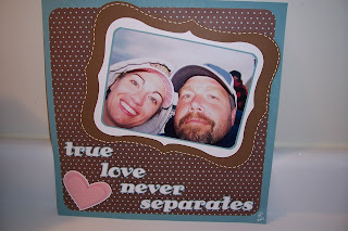
Love Never Separates
This is a layout that I did last week. It is very rare that I do an actual layout- I really struggle with them. I am working on a new scrapbook and this is the first photo that I will be putting in it. It's rather simple but too much on a layout just looks like clutter to me. What do you think? Does it need anything more?


Labels:
Cricut,
Family,
Hello Kitty Font,
Layouts
Subscribe to:
Comments (Atom)


